Creating a web page and blog, the Texinfo way. 
A website’s materials aren’t HTML tags, CSS, or JavaScript code. Rather, they are its content and the context in which it’s consumed. A website is for a visitor, using a browser, running on a computer to read, watch, listen, or perhaps to interact. A website that embraces Brutalist Web Design is raw in its focus on content, and prioritization of the website visitor.
We all know that personal web pages and blogs have lost popularity. I’ve now solved the main reason behind it: no easy way to do it using Texinfo.
What is it 
texiblog is the result of my journey trying to find a simple
solution for restarting a personal website, with updated articles –
so, a website that is also a “blog”. There is no lack of solutions
out there, from Wordpress to static site generators, but I didn’t
found one that completely satisfied me.
The result viewed in lynx: completely usable.
I describe it more thoroughly in the Project section:
texiblogis my home-grown solution for building a static site, and is what is behind my personal website. It usestexi2anyto create the HTML from Texinfo files, adds some styling options, creates updated menus from the posts (to provide an easy way to check recent articles), and usesm4throughout as a pre-processor and as a way to create the Atom and RSS XML files, as well as other niceties.
So, there you have it: a Texinfo website, with some minimal styling
meant to keep the inherent simplicity of the approach, that uses
m4 for most of the things that aren’t directly done by
texi2any (included in Texinfo). It outputs HTML, ready to
deploy anywhere, but can also create a info file, or a PDF, or
everything in a single text file.
The code is available at the texiblog Notabug repository.
What’s Brutalist about it? 
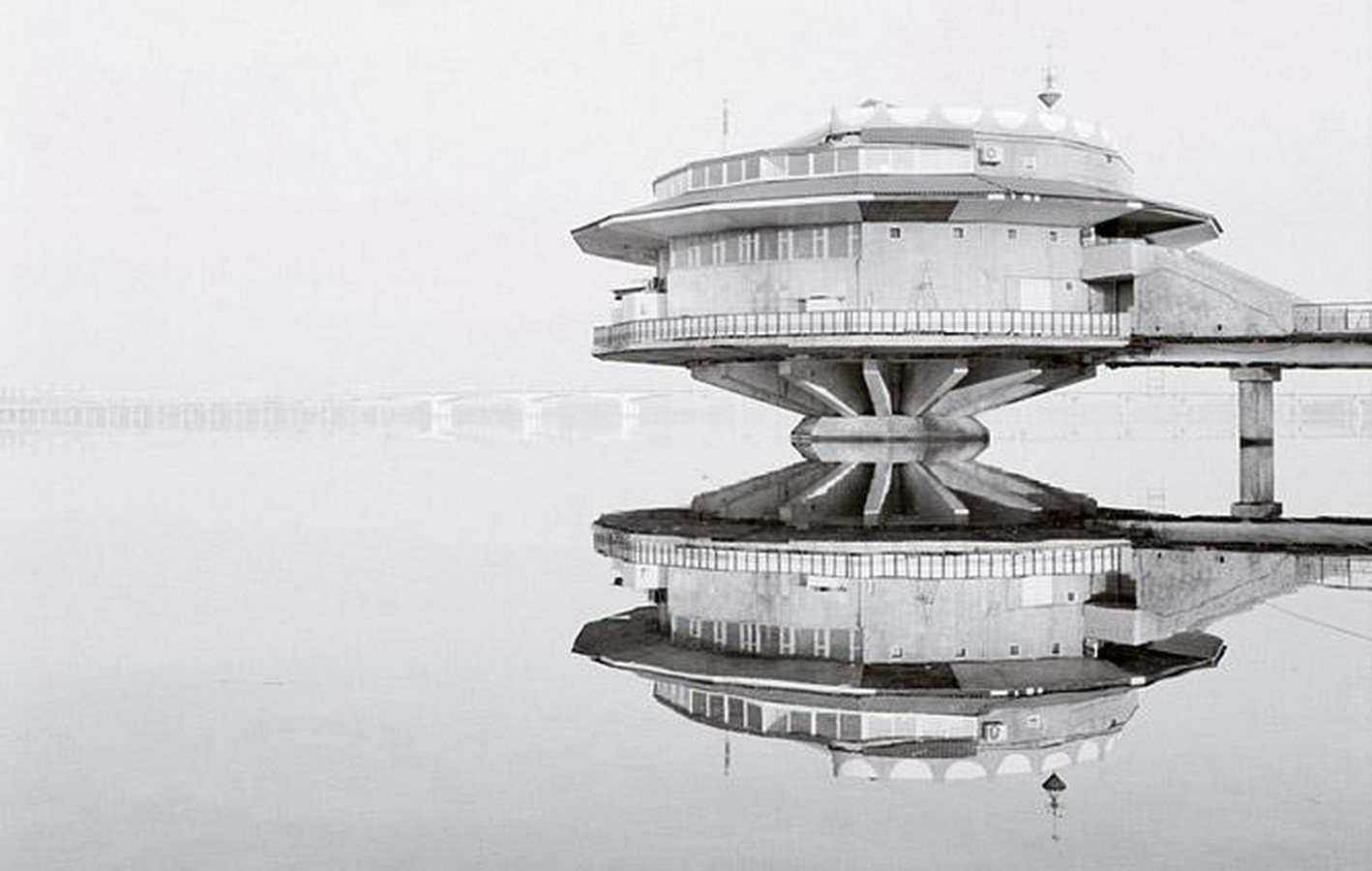
Het Poplakov Cafe (Dnipropetrovsk), Ukraine. A popular example of Soviet brutalism with a space-travel twist.
Very little and, amazingly, also a lot, depending on how you look at it.
The topic of how Brutalism applies to web design has seen some interesting discussions in recent years, also tied with the increased appreciation for the architectural style. There are two main approaches, which are also largely incompatible:
- Brutalism as a retro-aesthetic
-
This is the most visible one, and also the one that is noticeable more purposeful: websites apply complex designs that make them look “raw”, often using a colour palette and fonts reminiscent of the ones used in the 70s-80s. The focus is more a recreation of the aesthetics around Brutalist architecture, including things that were not part of it but that were used at the same time.
The gallery at Brutalist Websites shows many such sites.
- Brutalism as adherence to the original principles
-
This is less concerned with recreating a particular aesthetics, even though it ends up having one due to the application of the identified principles – one that often recreates early web pages, with minimal or no CSS at all and raw HTML elements used in their default forms. This applies Brutalism to web design by stressing content as the raw material, and everything else should revolve around it.
David Copeland’s “Guidelines for Brutalist Web Design” is a great example of this.
By using Texinfo, and the output produced by texi2any,
there’s by default a “rawness” of the latter kind, given the little
to no styling done by default. The additional styling I did (maximum
width, side images in large screens) was made in a way that keeps the
focus on the principles identified there. This was not done initially
on purpose: I found “Brutalist web design” while searching around
for minimal styling suggestions that kept content at the centre stage,
and the main concepts behind it are already well-served by the default
ouput.
Why a personal site at all these days? 
Having a personal website was the norm when the World Wide Web exploded in the 90s: not necessarily a domain, but having a “tilde” webpage somewhere was part of using the web 6.
While there were always attempts at building “walled gardens” (AOL was one of the biggest, and in Portugal I still remember that there was an attempt of making “The Microsoft Network” another one), what ended up leading to the decrease in personal websites was the growth in social networks, which made keeping a personal page less of a requirement: the “webpage” became the “profile page”, often split in many different networks.
This was, at least, what happened to my online presence in the last decade or so: instead of writing in my page, I started to write in LinkedIn, or in Twitter, or using GitHub.
I feel we are at a juncture where increased atomisation is fueled by social networks, which are themselves fracturing and making it obvious that there are real risks in making them our main internet presence. This page is my attempt at reclaiming this presence, and by doing so going back to some of the core principles of the world wide web.